Make a beat cover yourself: what clicks in the shop feed
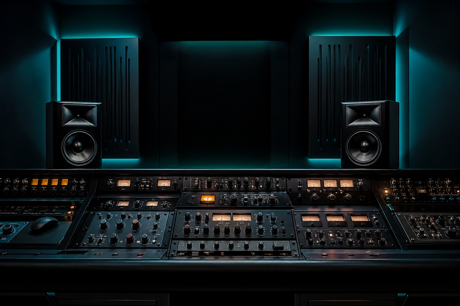
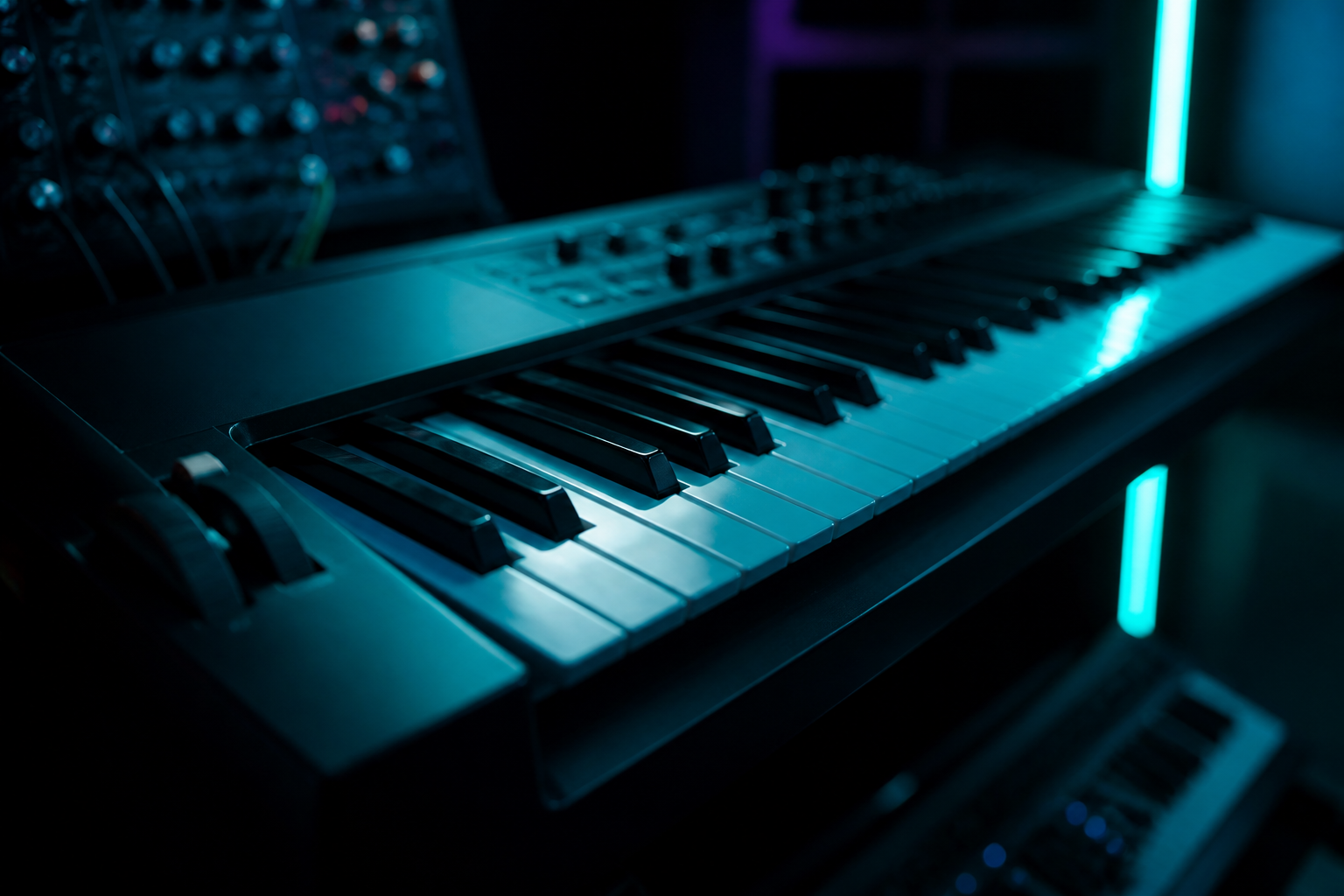
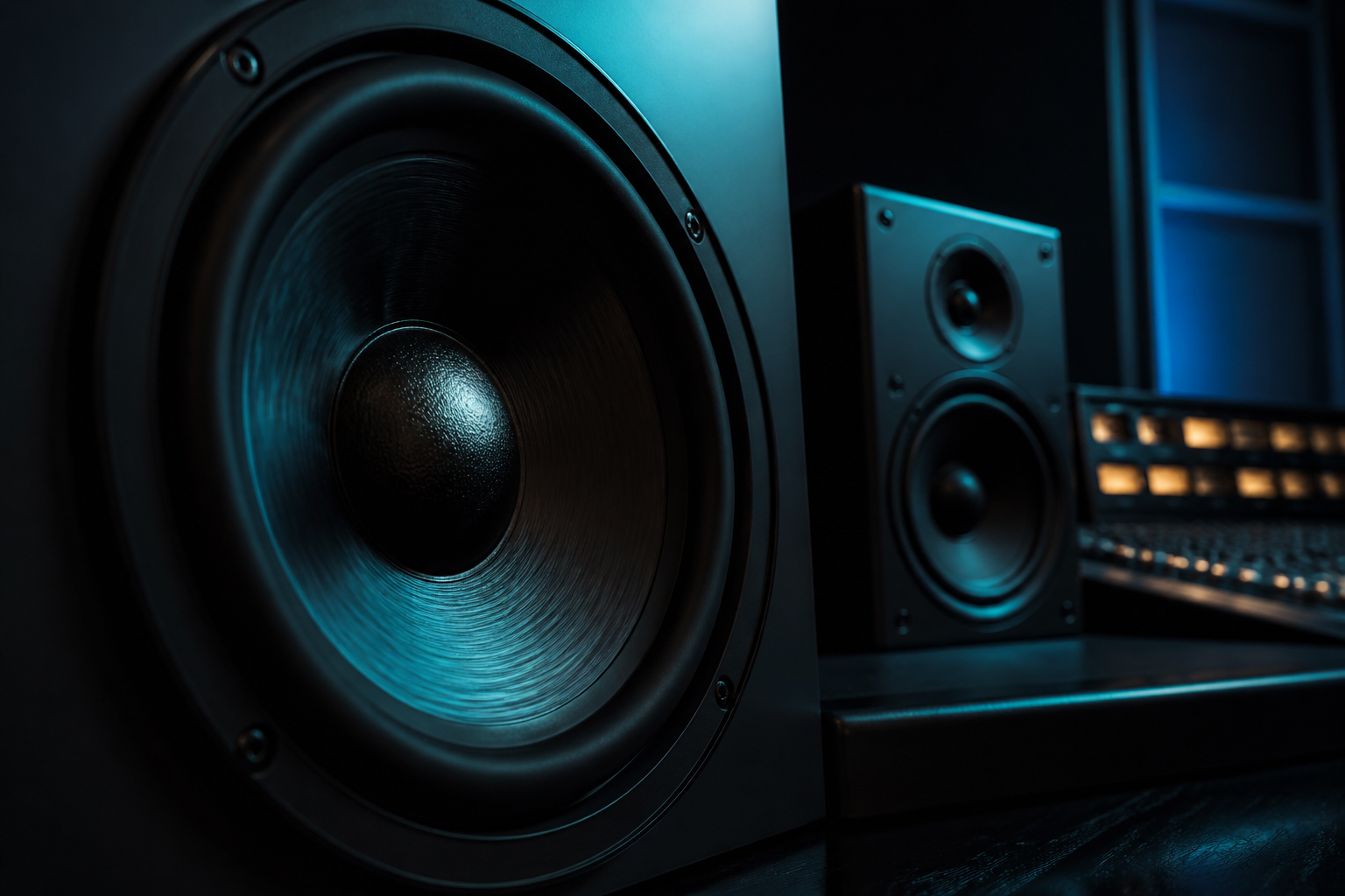
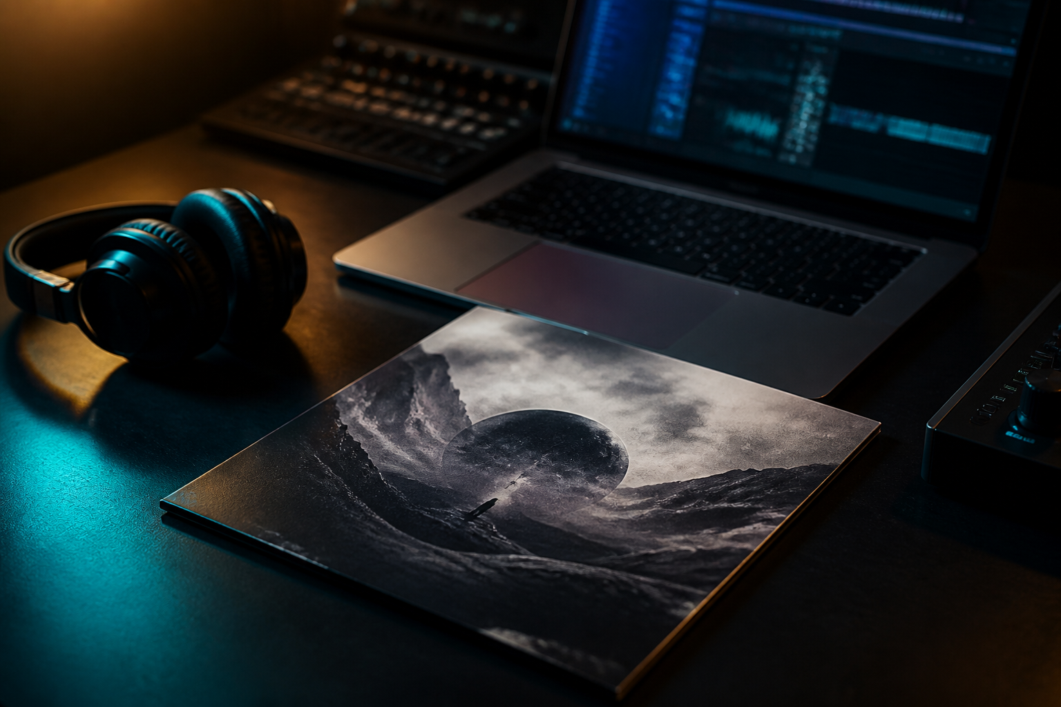
A beat cover has to read in a square: strong subject, little type, contrast against the next tile. Artists scan the catalog. They do not read your filename. The cover is the first click – before BPM and preview.
The short answer
- 1:1, at least 1000×1000, better 1400×1400
- One subject, not a collage pile-up
- Do not stamp the beat title as giant type on the image – the shop already shows the title
- Photoreal AI: tick AI image in the dashboard. That is labelling, not a stain
Then the listing: Your beat in the shop. Apply to upload: Become a producer.
What dies in the feed
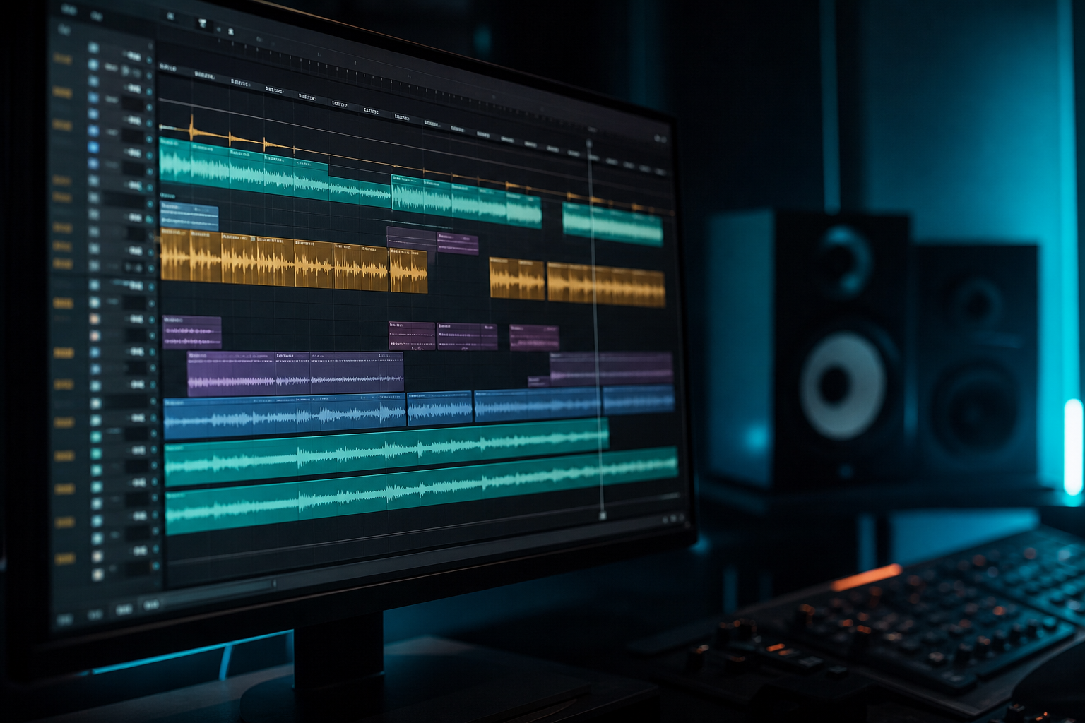
Too dark with no bright point. Ten logos. Unreadable fonts. An FL Studio screenshot. A face you cannot clear.
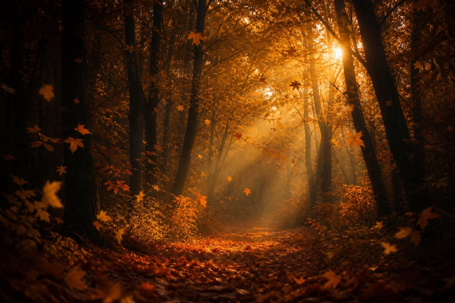
A cover that immediately has a mood on a phone (cold, gold, night, concrete) beats a “pro” template with five badges.
Pick a subject
Ask: sad, dark, melodic, street? The cover must match the mood tag and the preview. “Sad” plus festival neon is a break – people bounce.
Series: one repeating element (frame, colour, object) makes your catalog a brand. Every cover totally different looks like a random folder.
AI and stock
AI images are fine if you label them. No prompts that clone real artists 1:1. No stolen press photos.
Stock: check the license. A cover twenty other shops also use signals an interchangeable beat.
Export
PNG or JPG, not 8 MB of waste. Look at the cover small (tile size). If the subject only works fullscreen, it is dead in the shop.